Okay, imagine this: You're reading this incredibly long article (not this one, hopefully!) about the history of rubber ducks (yes, it exists). You scroll... and scroll... and scroll some more. And then you suddenly need to remember what the section you're reading is actually about. You desperately try to scroll all the way back to the top to see the heading. Annoying, right? Been there, done that!
That's where our little friend, the sticky header, comes in to save the day! We're talking about keeping a title, a navigation bar, or any important element permanently visible at the top of the page, no matter how far down someone scrolls. Think of it as a friendly guide always showing you the way. And, yes, it's easier than you think!
Why Bother with a Fixed Header?
Seriously, why should you even care? Well, here's the thing:
- Improved Navigation: Imagine having your main menu always available. Instant access! User experience gold!
- Better Branding: Your logo or brand name stays in sight, reinforcing your identity. Subtle but effective.
- Contextual Awareness: As in our rubber duck example, users always know where they are within the page's structure. This is crucial for long-form content.
- Enhanced Usability on Mobile: On smaller screens, screen real estate is precious. A fixed header makes essential elements constantly accessible. (Think tiny phone screens; are you optimizing for them?)
How to Create a Fixed Header in HTML/CSS
Alright, let's get our hands dirty! It boils down to some simple CSS.

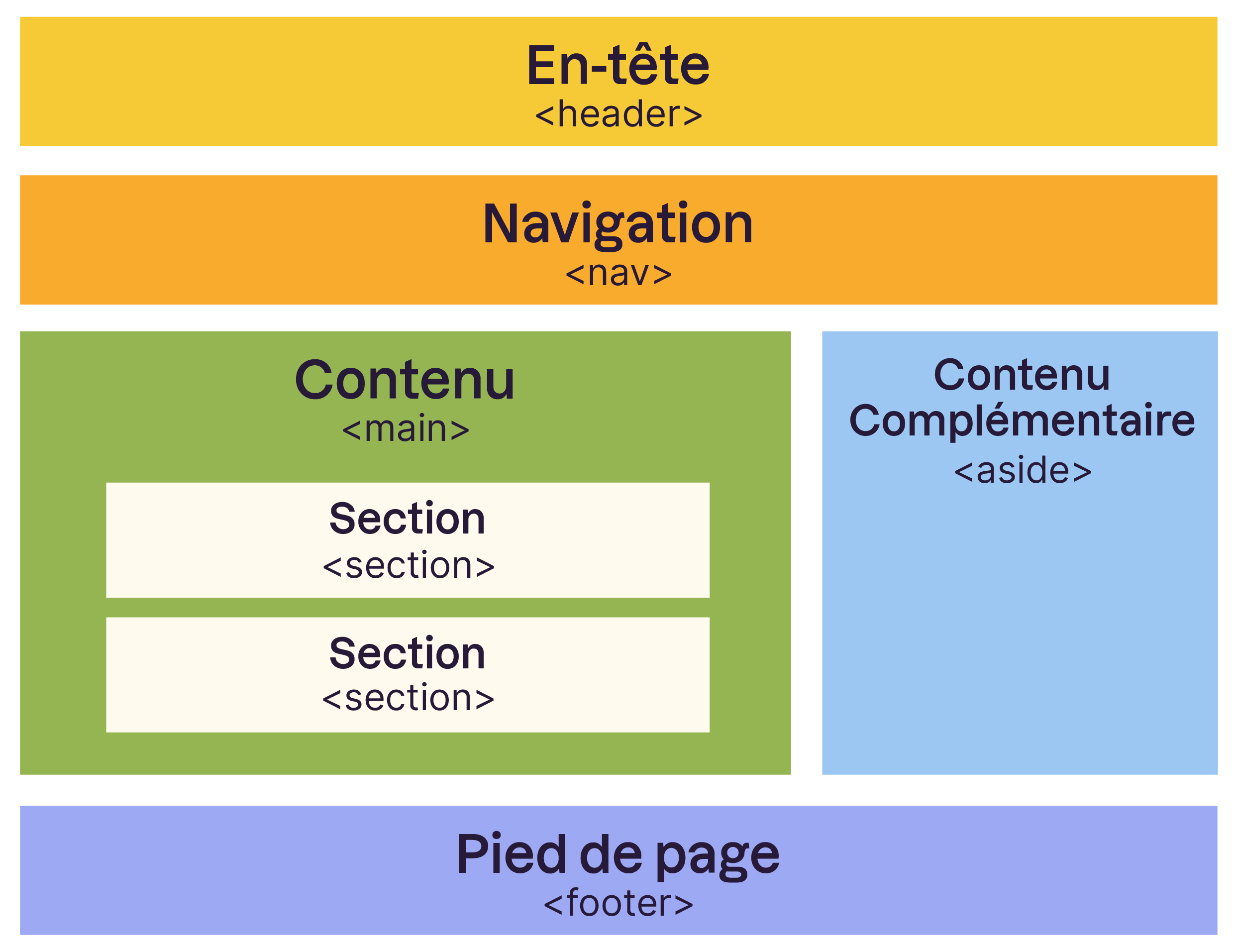
First, you need to identify the HTML element you want to "stick" to the top. This is usually a <header> tag, a <nav> element, or even a simple <div>. For example:
        <header id="my-sticky-header">
            <h1>My Awesome Website</h1>
            <nav>
                <a href="#">Home</a>
                <a href="#">About</a>
                <a href="#">Services</a>
                <a href="#">Contact</a>
            </nav>
        </header>
Next, the magic happens in your CSS:

        #my-sticky-header {
            position: fixed;
            top: 0;
            left: 0;
            width: 100%;
            background-color: #f0f0f0; /* Or whatever color you fancy! /
            z-index: 100; / Make sure it stays on top of everything else /
        }
Let's break it down:
position: fixed;: This is the key! It makes the element fixed relative to the browser window.top: 0;: Pin it to the very top of the screen.left: 0;: Pin it to the very left of the screen, so it stretches across the whole top (typically).width: 100%;: Make it span the entire width of the viewport. You might want to adjust this if you have a specific layout.background-color: #f0f0f0;: Give it a background so it's visible! Change this to your liking.z-index: 100;: Very important! This determines the stacking order. Make sure it's a high number so your header stays on top of all other content. (Imagine it slipping *behind everything else… disaster!)
A Few Things to Keep in Mind
- Content Overlap: Make sure your fixed header doesn't cover up other content when the page first loads. You might need to add some padding to the `body` or the elements below the header to create some space.
- Responsiveness: Test your fixed header on different screen sizes. It might need adjustments (font sizes, layout) to look good on mobile. Media queries are your friends!
- Performance: Too many fixed elements can sometimes impact scrolling performance, especially on older devices. Keep it lean and mean!
And that's it! You've now mastered the art of the sticky header. Go forth and create user-friendly, easily navigable websites! Now go read about those rubber ducks, but at least you know how to make that page bearable!


+Le+corps+du+document+Les+attributs.jpg)